Tuesday, 10 January 2017
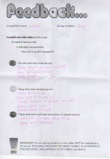
Music Video First Draft Feedback
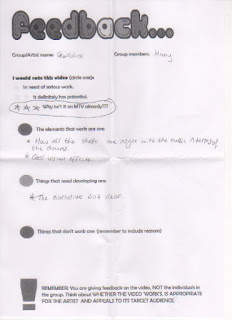
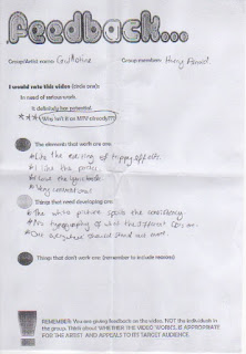
Here is the feedback for my music video first draft. People liked my editing style and the psychedelic visuals. I have learnt that I need to develop my narrative as it was lacking much of a plot in my first draft. I will improve on this by working out a way of making the narrative more clear for an audience through brainstorming ideas.
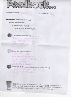
Digipak and Magazine Advert Review
Here is the review of my digipak and magazine advert. I will take this feedback into consideration and will apply it when I am re-editing digipak and magazine advert,
I received lots of constructive criticism such as I needed to make my narrative more clear. I will follow this criticism so that my video has a narrative easy for an audience to follow.
Thursday, 5 January 2017
Filming Log
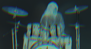
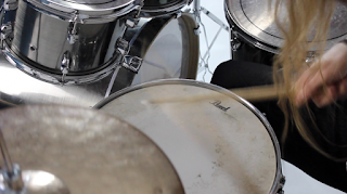
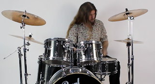
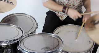
Here is the first performance footage that I filmed. I used a white screen background to make the drum performance looked like it was filmed in plain white room as this would give me a good start for my editing. I used a camera on a tripod to allow my to place the camera in a number of different ways to give different shots of the drums being played. I will improve on this by re shooting some of this free hand.
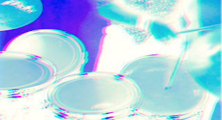
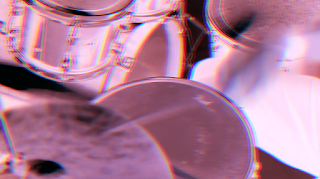
Above are the screenshots before and after some editing. These are just basic edits that helped me get to grips with the way I want to edit my music video and achieve a psychedelic and VHS look to the music video.
Test Footage
Here is the footage from my original narrative idea. I was happy with how the footage came out and it was all in focus and very clear. A number of camera shots were also used. However, once I had added this footage to the performances footage I noticed that they clashed. This was due to the editing style of the performance footage being very psychedelic and VHS looking and this footage being to clear and clashing colour wise. This inspired me to change the narrative to something a little darker colour wise but also including neon colours. I will now change the narrative to something looking like a 'rock and roll' night out in London including lots of quick shots of things relating the stereotypical rock and roll lifestyle.
Production Log
Magazine Advert
Here is the first draft of my magazine advert. I used a different image to the front cover for the main image of the poster. I placed the front cover in the right hand corner of the ad with the bands logo in the upper centre of the ad. I added a release date along with the places you can listen to the album on streaming services online. This is show proper where the album can be brought/listened to. The record label is also on the bottom left of the ad to show people who the album is being released by and this can hint to people what the albums sound may be like.
Subscribe to:
Posts (Atom)