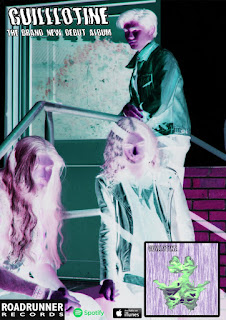
Here is the adjusted version of my magazine advert. After receiving feedback on my advert it was agreed that the placement of the text on the advert was in the wrong places and looked slightly messy. To correct these errors I placed the text in different places until I found a spot where it looked the most professional. I placed the text in the top right hand corner as this is where the eyes naturally gravitate on the poster.
No comments:
Post a Comment