Name of artist
This is probably the most common convention of all advertisements as it serves as the main promotion for the artist and is what brings them the popularity and validates that it is their work.
This is probably the most common convention of all advertisements as it serves as the main promotion for the artist and is what brings them the popularity and validates that it is their work.
Below is Pearl Jam's print advert for their album 'Lightning Bolt'. This has Pearl Jam's name in a very big font that stands out. This is to help an audience identify with the product being advertised and they can know what they expcet just from seeing the name.

Image An image that relates to the album being advertised is usally seen on the advertisemnt.
Image An image that relates to the album being advertised is usally seen on the advertisemnt.
 This is famous of how Nirvana used the image of Nirvana's album 'Nevermind' cover to promote the album. Showing an infant underwater with money on a fishing line, is not really important in terms of reference within the music. However, this could hold a link with the themes or genre of the music, showing a child and water representing pureness, while the money may show desire.
Logo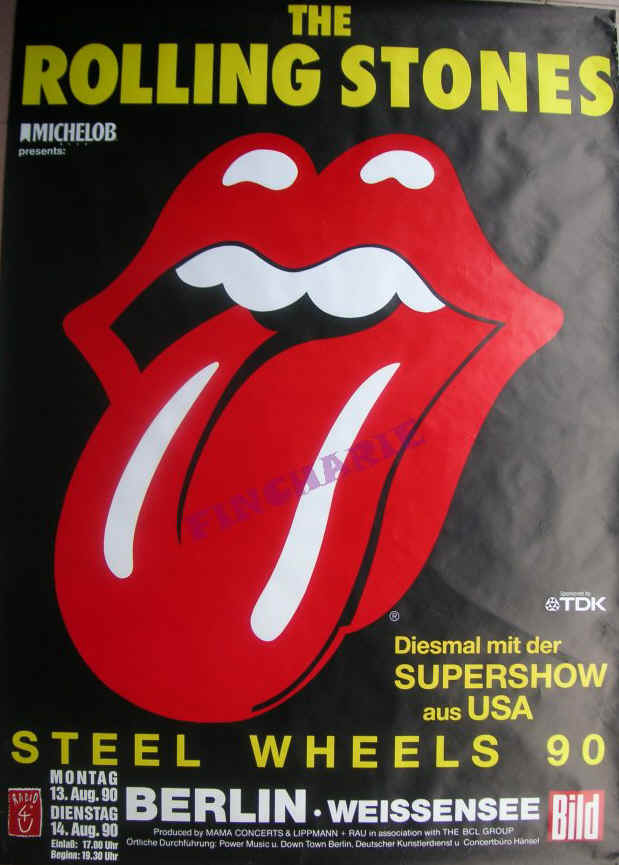
One of the most recognisable logos within music is the Rolling Stones using the tongue and lips image. the fact that this image has become extremely popular and significant to the artists means that it is instantly recognisable to most audiences. This is proved with the image showing the logo in the centre of the advert, attracting the most attention and, even outshining the actual name of the band, showing that they do not necessarily even need to feature their own name, due to the attribution of the logo.
One of the most recognisable logos within music is the Rolling Stones using the tongue and lips image. the fact that this image has become extremely popular and significant to the artists means that it is instantly recognisable to most audiences. This is proved with the image showing the logo in the centre of the advert, attracting the most attention and, even outshining the actual name of the band, showing that they do not necessarily even need to feature their own name, due to the attribution of the logo.
Make sure all posts have commentary
ReplyDeleteMissing production logs
Show more evidence of planning - costumes? props?