Friday, 11 November 2016


Here is the first draft of my digipak. I chose the location for the photos as brick walls and suburban areas are conventional for the grunge rock genre. I edited the images on photoshop by inverting the colours and adjusting the colour balance to achieve a psychedelic look.

Thursday, 20 October 2016

Artist biography


Guillotine are a grunge rock band from South East London that formed in January  2013. They consist of Sid Rivers (vocals and guitar), Dom Chehal (bass) and Tom Ross (drums). The band were formed when Rivers met Chehal at a party and they discovered they had a love of grunge and other forms of rock and metal music. The two began jamming songs together and eventually begin writing their own songs. During this process they met Ross and they wrote their first EP together. On the 8th June 2013 the band played their first gig at the Hope and Anchor  in Islington. From here they began gigging as often as they could, building a fan base and self releasing their first EP. In the 2014 signed a three album contract with roadrunner records. They chose this label as they allowed them to have complete creative control and they liked other bands on the label. The band’s sound has been described as a modern take on 90’s grunge music. They dress like a 90’s grunge band and love being on tour getting to play gigs around the world. The band are due to release their debut album on Roadrunner Records late 2016 along with two singles and music videos to correspond and help promote the album.

Thursday, 13 October 2016

Mood Board


Here is my mood board. This shows of things that can represent my artist. This includes items of fashion that are synonymous with my artist, and activities that the artist would take part in. Also the instruments used by the band are shown which can give an understanding in to the type of music the band play.

Conventions of magazine adverts for Digipaks - Digipak Research

Conventions of magazine adverts for Digipaks
Name of artist

This is probably the most common convention of all advertisements as it serves as the main promotion for the artist and is what brings them the popularity and validates that it is their work.
Below is Pearl Jam's print advert for their album 'Lightning Bolt'. This has Pearl Jam's name in a very big font that stands out. This is to help an audience identify with the product being advertised and they can know what they expcet just from seeing the name.


Image An image that relates to the album being advertised is usally seen on the advertisemnt.

This is famous of how Nirvana used the image of Nirvana's album 'Nevermind' cover to promote the album. Showing an infant underwater with money on a fishing line, is not really important in terms of reference within the music. However, this could hold a link with the themes or genre of the music, showing a child and water representing pureness, while the money may show desire.
Logo
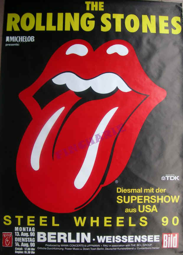
One of the most recognisable logos within music is the Rolling Stones using the tongue and lips image. the fact that this image has become extremely popular and significant to the artists means that it is instantly recognisable to most audiences. This is proved with the image showing the logo in the centre of the advert, attracting the most attention and, even outshining the actual name of the band, showing that they do not necessarily even need to feature their own name, due to the attribution of the logo.


Digipak Research


Band Logo

Here is the logo for my artist. I choose this font as I feel that it represents that artists image well. It has almost a rough and scruffy handwrittren look to it that the artist also has. The font choosen also represents the artist well as it is fairly simple and not over complicated just like the artists music.